-
Interior Designers: KC Design Studio
- Area: 33 m²
- Year: 2019
-
Photographs:Hey! Cheese
-
Manufacturers: Galvanitas, Karimoku New Standard, dutchbone

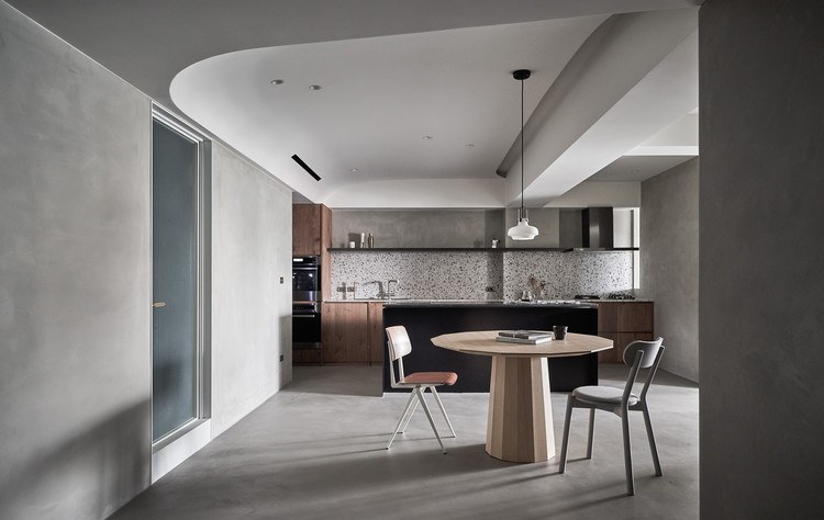
Text description provided by the architects. The building faces the streets of all directions fearlessly, forming the fragmental indoor layout. The residents often feel the inconvenience in using the space. We fill the fragmental areas with the service functions of the residence to create the complete and open public and private space. The design point of the open space is the layer presentation. The connection and openness of the living room, dining room, and kitchen will be felt when you enter the house from the balcony.

Through the furniture and surrounding design corresponding to each space, from the exterior to the interior, from the front to the back, the different materials or the furniture heights are applied to present the rich but not messy space expression. The gray concrete texture serves as the basis of the space. The use of wood, iron pieces, terrazzo, and striped glass creates the mild and lively tone, which is embellished with the golden metal parts to make some exquisiteness.

With the limitation of the low house height, we develop a new ceiling lexicon by adjusting the form to the function. The required equipment such as the air-conditioner, piping, lights, and projector is arranged at the corner of the space. Imagine a shrink wrap cover the ceiling upwards to conceal the original structure, add equipment, and further form the dome design.


The multidirectional curved surface ceiling has no lines. Therefore, people will not directly feel the height of the space, which blurs the original sense of oppression.


